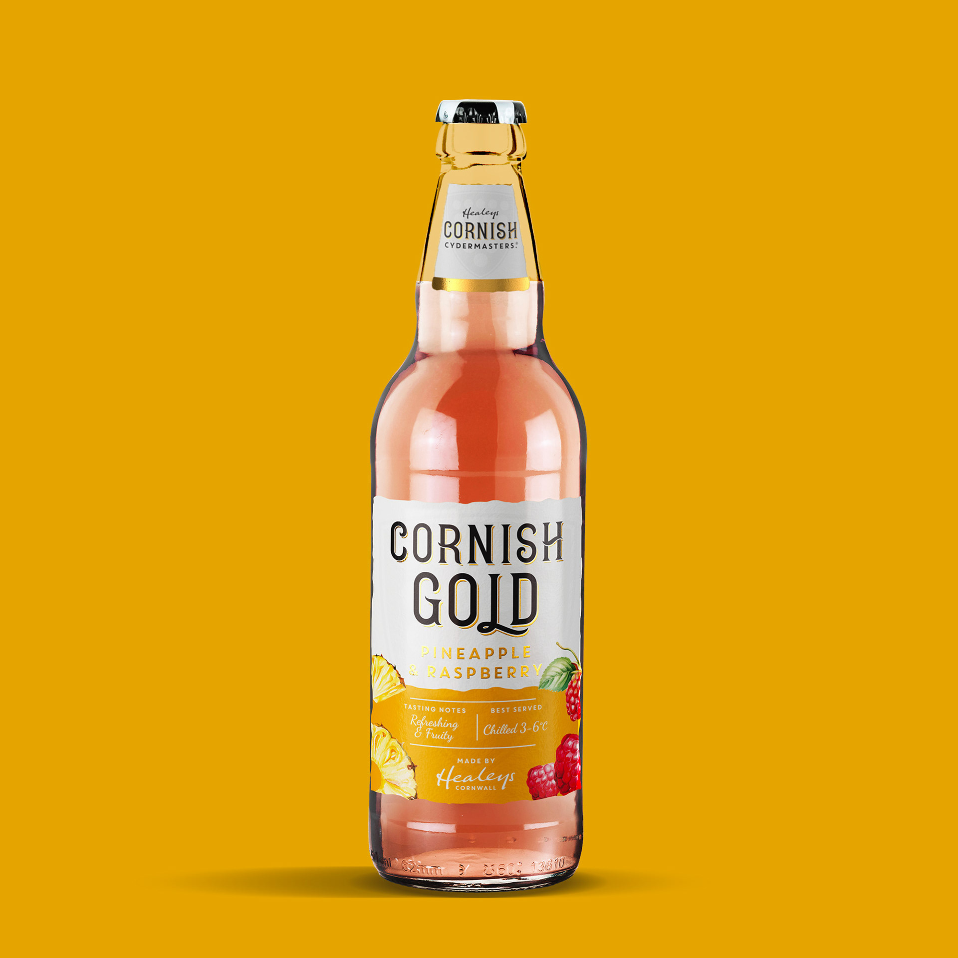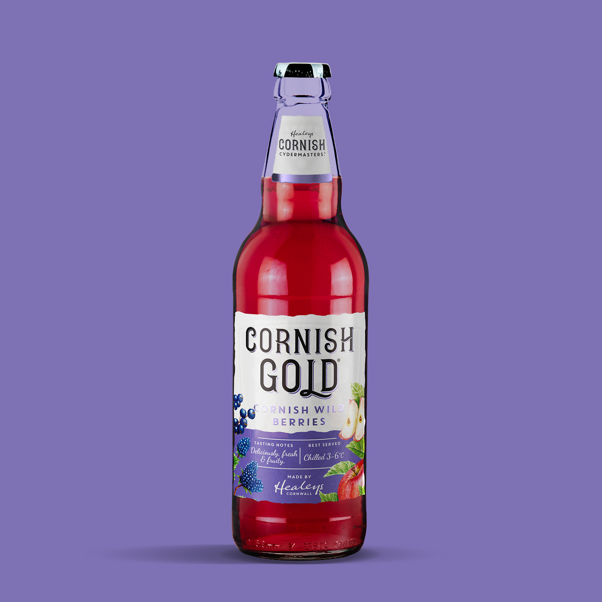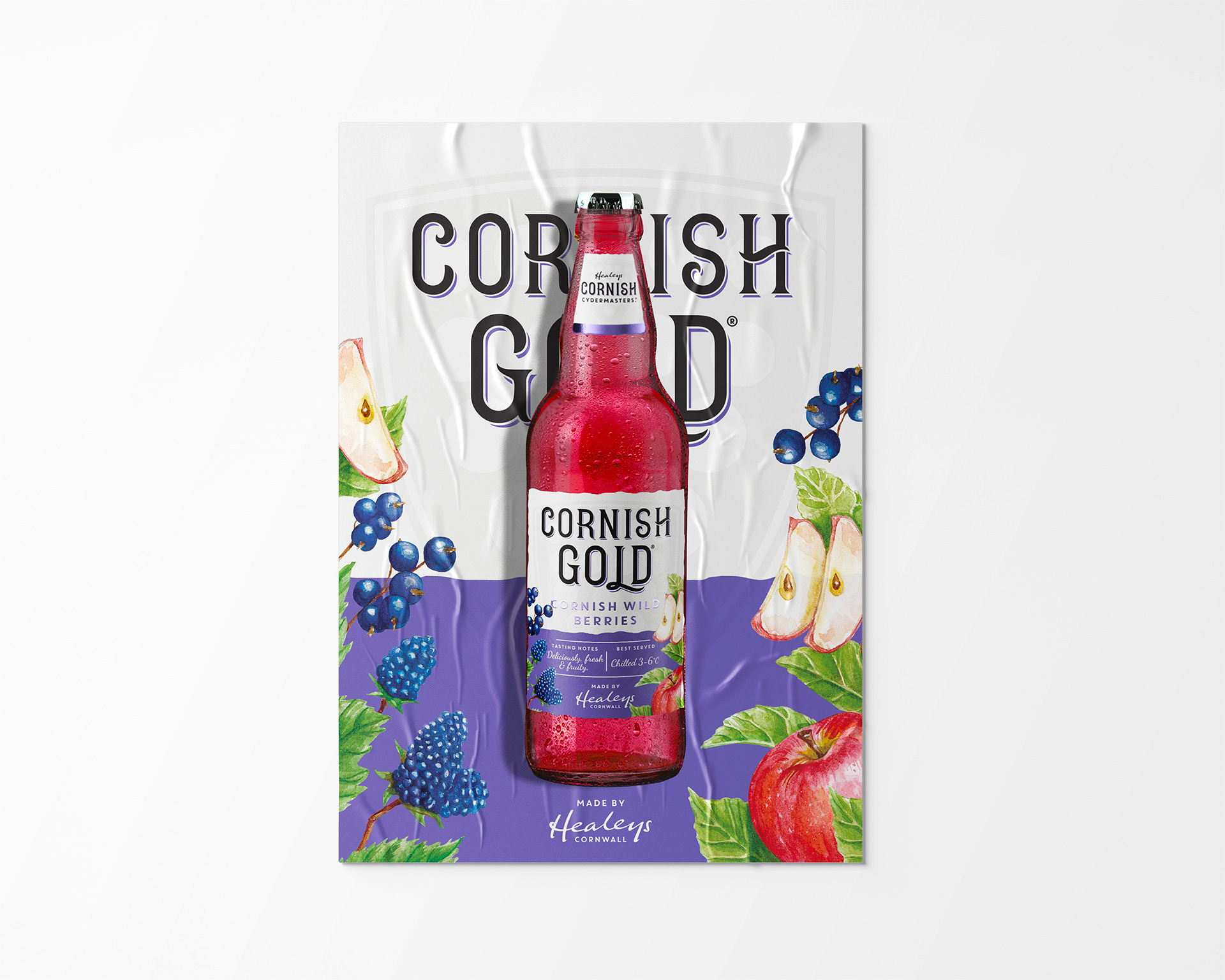
Cornish Gold by Healeys Cydermasters refresh
The Cornish Gold rebrand came about more as a whim than anything. The product was good, the the original brand had potential but as of yet unachieved. It's market presence was clearly for an older slightly more sophisticated audience. But it was under-appreciated. with a black label and simple gold elements. It looked classy but not enough to stand out or draw the eye.
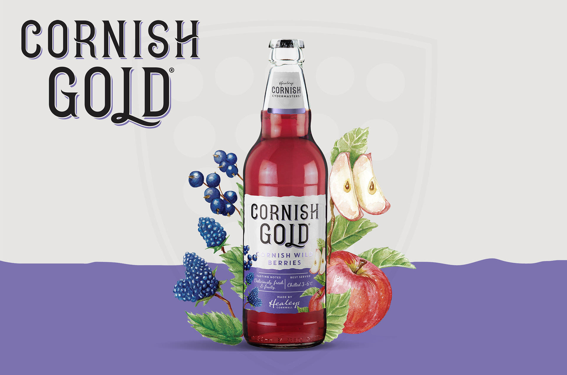
Healeys had to drop it's flavoured range due to underperformance so I decided to have a play with it's identity adding more colour and illustrative elements to sell the flavours. I did a light pitch and it was loved all around. So I got to work painting the flavours illustrations. Before I knew it it was on a sign off sheet ready to send to print.